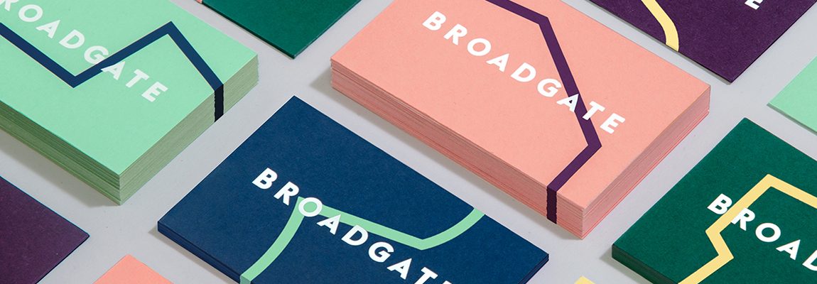
For most companies, developing your brand aesthetic may be one of the most challenging parts of the creative process. It’s what makes your business draw attention from potential clients at first glance, so the first impression is important.
So how does one make their business unique and stand out from the rest? Your choice of colors and overall brand aesthetic are a vital tool to telling the story of your business to audiences, for numerous reasons.
As humans, it’s natural for us to be attracted to visuals. Perception is an ability used every day in our daily lives, and doesn’t just affect our sight, but our overall senses as well. Often you hear the saying “Don’t judge a book by its cover,” yet we’ve all done it. Whether you’re meeting someone new or shopping for an item, you’ve made a judgement based on first glance.

Photo by Chris Liverani on Unsplash
“You never get a second chance to make a first impression.” – Will Rogers
Questions to Ask
In order to make your brand stand out while staying original, you need to know your brand first.
- What is your goal with the brand?
- Who is your target audience?
- What message do you want to convey to your audience?
- How do you want others to view your brand?
These questions are important to ask yourself as you figure out what the visual design for your brand will be like. In order to be successful, your clients have to not only know who you are, but like you enough to keep coming back.
Knowing Your Target Audience
What makes a brand stand out to the audience is something we all have: personality. It’s what makes each individual unique, and this applies to brands as well. In order to tell the story of your brand, the way you express your message is important. This is where visuals such as aesthetic and color play in.
It also depends on who your target audience is. Is your brand targeted towards a younger audience such as millennials? Or is your brand targeted towards a more older and professional group of people? Depending on who your audience is, this helps determine the visual style and look for your brand that will attract that certain group you’re trying to reach.
https://ca.coach.com (Older target audience)
https://www.nike.com/ca/ (Younger target audience)
Deciding on a target audience narrows down to what the style of your brand will be. Is it going to be modern? Minimalistic? Retro? Classic? Research what’s trending amongst your target audience to know what works and what doesn’t.
Aesthetically-pleasing designs is a starting point in putting your target audience in a positive mood, providing a long-term effect on how clients view your brand. Colors are pivotal in storytelling and are often associated with expression. Emotions and personality are resonated through color, and plays a major role in media and culture. Are you going for something classy for a more mature and professional audience? Or is your brand more casual and fun for a younger audience?
Knowing proper color palettes and deciding on one is crucial for brand development. The last thing you want is for your brand to look tacky and cheap.
- Stray away from the typical RGB combination that every other company so often uses, and try to mix it up a bit and don’t be afraid to throw in a bold color or two to add some flare (easy on the eyes though, nothing too vibrant!)
- Going for classy and elegant? A soft, romantic color palette such as light neutrals and blues can give a very sophisticated look
- Keep in mind that if you’re planning to print your logo, it should look good in CMYK too
Design & Success
There are many companies who have become easily recognizable thanks to their signature style. For example, look at Apple or Amazon. These companies have become some of the world’s top businesses, with millions using their services daily. One look at their logo and you immediately know what the company is. Easily definable without anyone having to question who or what they are, their style has become part of the brand’s signature which distinguishes their individuality.
https://www.garycarmell.com/winners-like-apple-amazon/
Another example is the beauty brand Glossier. What started out as a small indie-beauty business became a well-known cult favorite soon after its launch, taking the beauty industry by storm. Targeted towards young millennials, many have praised the company for the way it promotes natural beauty and skincare before makeup.

https://www.pinterest.ca/pin/239394536427362473/
Upon first glance, the brand resonates simplicity, but doesn’t come across as boring to viewers. Associated with light pastel colors such as “Millennial Pink” and light shimmer, the brand doesn’t come across as over-the-top unlike other beauty brands. The design and visuals are minimalistic, making the brand stand out to the younger audience because of the ongoing trend of minimalism in that target audience.
Functional Design
As you develop your brand, keep in mind how the aesthetics balance out with usability, as design should also be functional. Your overall look should reflect what your brand is trying to sell, and being able to stay consistent with your audience is great when it comes to showcasing your personality through your brand. Putting importance in your aesthetic helps you get a better understanding of your own brand, while connecting with your audience throughout the brand’s growth.
The creative process can be difficult at times, but once you have it developed, the options of printing materials for your business are endless.
Start showcasing your brand aesthetic by heading over to SinaLite and check out the many different ways you can reach out to your audience through print.
Related post: Viagra: Understanding Its Uses, Benefits, and Risks


